
Microsoft Excel has numerous capabilities some of which are familiar such as the ability to sum a column, or create a chart. But there are also many that are little-known and yet very helpful. In this article we will examine five often overlooked capabilities of Microsoft Excel. For the purpose of this article, we will be using Microsoft Excel 2016, but many of these are available in earlier versions. Microsoft has added numerous capabilities to Excel over the years, and we recommend keeping current to gain these advantages. Hopefully, you find these overlooked Excel capabilities helpful!
Overlooked Excel Capabilities #1: Rollover Aggregates
Often times you might want to look at a range of numbers and determine the sum of those numbers, or average, etc. You may be tempted to create a formula in the spreadsheet in order to do this, but if you do not need to persistently see display that value you can simply highlight a range of cells and Excel will show you the sum, average, and count of values in the lower right corner of the status bar.

Overlooked Excel Capabilities #2: Absolute References
This capability is actually something that has existed since very early versions of Excel, and in fact has been in all spreadsheets since the 1980s. But we included here because often times people do not understand how cell referencing works.
Normally when you create a formula in a spreadsheet it is using what is called “relative referencing”, which means that if you have a spreadsheet with a value in cell A1, and a second value and sell A2, and then you create a formula in cell A3 to multiply the two previous numbers, the formula will be relative. This then allows you to copy the formula into column B, C, and so forth so that each row three multiplies the values in rows 1 and 2.
However, you may want to always reference a specific cell in your formula. For example, if you have a table of inventory items with their current sales price, and you would like to multiply every item by 1.05 in order to see what the price would be with a 5% increase, you may want to put 1.05 as a value in a single cell of the spreadsheet. This will allow you to change a single point, and the entire inventory would be updated so that you could change it from 1.05 to 1.06. In order to do this you must use an absolute reference.
First let’s look at what a relative reference looks like in the formula. In the figure to the right, you can see that cell A3 has a formula which is “=A1*A2”. This formula is the same in cells B, C, D, and E, but in each case the “A” is changed to the column header (e.g. “B”). In this case we have copied the formula from A3 into columns B through E on the same row, but in each case it converted the “A” into the appropriate column header.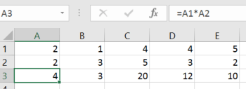
But what if we wanted to create a formula as we describe before with inventory parts and potential price increases? In that case we will need to have an absolute reference. Here is what that looks like:
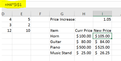
In this case we have a set of parts that we can sell, and each has a current price shown in column H. In column I, we have a formula which takes the current price and multiplies it by the factor which we are increasing it by in this case it is shown in cell “I1”, and is 1.05.
Note that the formula has a ‘$’ character inserted in front of both the column reference and the row reference, so that instead of writing the formula as “=H4*I1”, we have written it as “=H4*$I$1”. By doing this it will always reference cell I1 instead of adjusting it for relative position to wherever we copy the formula. This lets us enter the formula one time in cell I4 for the horn, and then copy it to all of the other lines in that column so that each item is increased by the value in I1. If we do not put the dollar signs in the original formula, it will use relative referencing so that the guitar would actually be multiplied by cell I2, which is blank. You can use absolute referencing with either the column, or the row, or both. So valid examples would include “$I4”, “I$4”, or “$I$4”.
Overlooked Excel Capabilities #3: Format as a Table
Sometimes you may want to use a set of data similar to a database, and be able to sort or filter the data so that you only see what you need to see, in the format that you would like to see it. In this case it is helpful to format the area as a table.
In this example we have a set of data for our employees which looks similar to this:
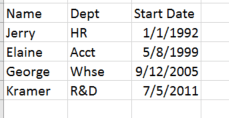
But this does not allow us to easily sort or filter the data, and in very long or involved data sets, may be hard to read from left to right. In this case it is much easier to work with it if it is formatted as a table. To do this, select (highlight) the range that represents the table, in this case I will be highlighting from “Name” and then down and over to the last start date for “Kramer”.
While this is highlighted, I then select from the home menu of the ribbon bar in Excel, the option for “format as table”.
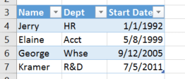
When I do this I will be presented with multiple options for how the table will be formatted with various colors, and row highlighting options. Once I have selected one, I will then be asked if my table has headers, and because I chose a set of data that does include column headers, I will click ok. The data area will be reformatted with banded rows and added drop down options next to each column header.
I now have many options to manage the data, including:
- Sorting the data by clicking the down arrow key next to any of the columns, and choosing “ascending” or “descending”.
- Filtering by some text or value
- Filtering the data by clicking the down arrow key next to any of the columns and choosing some of the options with checkboxes. This allows me to turn off and turn on the display of certain areas, so that for example and may only see certain departments in my data set.
By using these features, you can more easily manage a large data set in Microsoft Excel.
Overlooked Excel Capabilities #4: Sparklines
Sparklines, are a function that was added in Microsoft Excel 2010. These are small graphs that fit into a single Excel cell and represent a range of data, similar to the way you might insert a larger chart into a spreadsheet.
In our example we have a set of data which looks similar to this:

This is traditional data with information for revenue and customer count per month, and a calculation for how many new customers, or lost customers we may have experienced for the month.
There are three sparklines available to us in Excel each of which can be customized. They are:
- Line
- Column
- Win/Loss
In order to insert a spark line, you must be in an empty spreadsheet cell. It is recommended that it be wide enough to show a nice range of data, but you can adjust the width later. Once you are in this empty cell, go to the “Insert” tab of your ribbon bar, and find the spark lines available to you. These will look similar to this (from Excel 2016):

You can see that the three choices: line, column, win/loss are all available to you here. Click on the one that you choose, such as line and Excel will bring up a dialog box asking you for the input data that will be included in your sparkline. Select the data in your spreadsheet, and confirm that the cell you would like the data in is shown in the dialog box. Click the Ok button and the cell will show a sparkline chart. In our example we have graphed each of the columns of variable data in our spreadsheet and we can see three different spark lines.
Spark lines are very convenient way to quickly show data, and in fact if you have multiple columns of data from left to right you can show an in-line chart for that data, similar to the following:

Once you have inserted a sparkline, you can change the format by selecting the cell with the sparkline, and an additional toolbar option will be added to the ribbon called “Sparkline Tools Design”, selecting this will give you many more options.
Extra Tip: If you create a sparkling in one cell, you can copy it to others and it will copy the format and use relative data ranges.
Additional Info: https://support.office.com/en-US/Article/Use-sparklines-to-show-data-trends-1474e169-008c-4783-926b-5c60e620f5ca
Overlooked Excel Capabilities #5: Print – Fit to Page
Sometimes your data will not fit conveniently on one page, or one page width when you send it to the printer. For example, you may have too many columns to fit from left to right, and would like all of them to fit on one page in landscape mode. In order to do this we will take two steps.
- Change the orientation to landscape (optional)
- On the ribbon bar, click “Page Layout”
- Choose “landscape”
- Change the print scaling to fit on one page

- Click the Excel “File” option on the ribbon bar
- Choose “Print”
- At the bottom of the options you will see “No Scaling” by default, click this and you will see more options. Choose one of these each of which is described:
- “No Scaling” – the default option and which prints the pages according to the way they are laid out in the spreadsheet for sizing, etc.
- “Fit Sheet on One Page” – fits the entire spreadsheet, all rows and all columns, onto one printed page.

- “Fit All Columns on One Page” – fits all columns on a single page width, but entire print job may span multiple pages top to bottom.
- “Fit All Rows on One Page” – fits all rows on a single page but entire print job may span multiple pages left to right.
Using these options will allow you to have a much nicer print output but be careful if you overdo it, it will be too small to read.